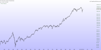
We all live in an exponential world, and many of the market analyzers use that fact in their analysis.
The main problem comes from fact, that sometimes analyzers use linear, sometimes logarithmic graph.
You can't use log scale and make linear calculations, and the opposite.
Have a look at the both graphics bellow:

At first hand they look totally different, and have nothing common. More observant of you have already noticed
that on both is DJ 30.
Here is an interesting example:
Let's suppose that you have invested $1000 in General Electric for $8 per share in 1995, it makes 125 shares. For two years the price rises to $16 and you cover the long, taking $8 profit per share in the pocket, which makes 100% profit.
Few years later the price rises to $30, and you decide to buy your favorite instrument again. But this time you spend $1000 to buy only 33 shares. However, the price is going higher, reaching $60 in 2000. Then you decide to sell again, taking profit $30 per share, which is 100% profit again. Visually the spread between the blue lines is four times wider than the red ones. It's easy to make a mistake, that the second trade's profit is four times bigger. It is so, because the graphic is linear.
Here is the same GE logarithmic scale example:

I have calculated GE Fibonacci retracement levels of the move from $8 to $60 in both ways:
Fibo
|
50%
|
61.8%
| |
Linear
|
33
|
27.1
| |
Logarithmic
|
21.54
|
17.05
|
If we follow the linear calculating, could make a conclusion that GE's 61.8%Fibo retrace is nearly ($27.10) of its rising up, and as an ewavers using Fibonacci tool to expect bounce up again.
The picture is totally different, if we have calculated that correction in logarithmic way. It is obvious, that 61.8% of the correction is nearly $17, and there is more dropping down.
Which scale to use?
If we are daytraders, can use both, because the difference is very small.
If we are swing or longer term traders or investors- the linear one.
P.S. The price now differs , I just use an example graph.


